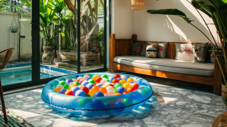
A ball pit is no longer just a functional toy. Today’s parents view it as a full-fledged design element that can highlight the character of a child’s room or even become its focal point. Carefully chosen ball colors can complement a minimalist design, liven up a neutral space, or add a harmonious accent to an already decorated interior. Scandinavian Minimalism in a Child’s Room The Scandinavian style has taken the contemporary children’s interior design world by storm, and for good reason. Bright, spacious rooms featuring natural materials create a peaceful environment for play and rest. A ball pit in this kind of setting requires a thoughtful approach to color. Neutral tones form the foundation of a Scandinavian-style ball pit. White, creamy beige, and soft gray create a calm base that doesn’t overwhelm the space. You can add subtle accents to this base—powder pink, sage green, or pale blue. These pastel accents liven up the composition while maintaining the restraint characteristic of the Scandinavian style. It’s worth remembering that functionality is also key in the Scandinavian style. The pool should be easy to move, and the balls should be quick to clean up. That’s why people often choose models with a lid or ones that can be folded away when not in use. Pastel sweetness that never goes out of style Pastel colors are a safe choice for indecisive parents. Delicate shades create a calm atmosphere and go well with virtually any interior. Powder pink, lavender, mint, peach, pale yellow—these colors can be mixed and matched freely, always resulting in a harmonious effect. The secret to a successful pastel arrangement lies in balance. Too many different shades can make the bowl look chaotic. It’s better to choose two or three main colors and complement them with white or cream-colored beads. This approach visually brightens the whole arrangement and makes the pastels appear more delicate. An interesting touch is adding metallic accents. A few beads in pearl, gold, or copper tones lend the arrangement an air of elegance. These accents look particularly beautiful under the light of lamps—they reflect the rays and create a subtle play of light. However, it’s important to exercise restraint—metallic accents should make up no more than 10% of all the balls. Bold contrasts for little explorers Not every child is fond of soft colors. Some little ones need visual stimulation, energy, and dynamism. For them, a play pool in vibrant, contrasting colors will be ideal. The classic combination of black and white is a timeless solution that helps develop young children’s visual perception. This contrasting combination is especially recommended for infants who are just learning to distinguish between shapes and colors. As the child grows, you can gradually add more colors—red, yellow, and blue. Complementary colors create electrifying combinations. Purple with yellow, orange with blue, red with green—these combinations spark creativity and encourage active play. Popular designs and color schemes: A gradient from light to dark (ombre effect) Rainbow transitions between colors Geometric stripes in equal proportions Concentric circles in various shades Random distribution with a controlled color ratio Minimalism that captivates with its simplicity Minimalist interiors require a special approach when choosing a ball pit. Every element must be well thought out, and the colors must be carefully selected. An excess of colors or a chaotic composition could disrupt the carefully crafted harmony of the space. Monochromatic designs work best. All the balls in a single shade—for example, various tones of gray or beige—create a subtle, elegant whole. Such a ball pit does not dominate the space but forms an integral part of it. An alternative is to choose two colors in a 90:10 ratio. A dominant neutral shade complemented by a delicate accent—for example, gray balls with a touch of pale gold, or white balls with a few black ones. This composition adds a touch of dynamism without disrupting the minimalist aesthetic. Your Own Composition – The Art of Mixing Colors Creating a custom color palette is a process that requires both courage and intuition. Instead of buying pre-made sets, more and more parents are choosing to design their own pool color schemes. Basic principles of composition: Choosing the dominant color (50–60% of the beads) Adding a complementary color (30–35%) Introduction of an accent (10–15%) Optional: neutral background (white or gray balls) You can find inspiration anywhere. A child’s favorite book, a poster on the wall, the view out the window—anything can serve as a starting point for creating a unique color palette. Some parents take into account the season in which their child was born, while others draw inspiration from their child’s favorite fairy tales. Testing color combinations before making a final purchase is the key to success. It’s a good idea to order small samples of colored pool balls and see how they look under different lighting conditions. What looks beautiful on a computer screen may be disappointing in real life.